Thursday, April 8, 2021

Blog 4

 Swatchy Schemey


Topic


            For my brochure I think I want to make a little pamphlet about vacation excursions. The colors I have in my picture are more on the tropical side which is why I think things like snorkeling and jet skis would work well with my colors.

Task 1


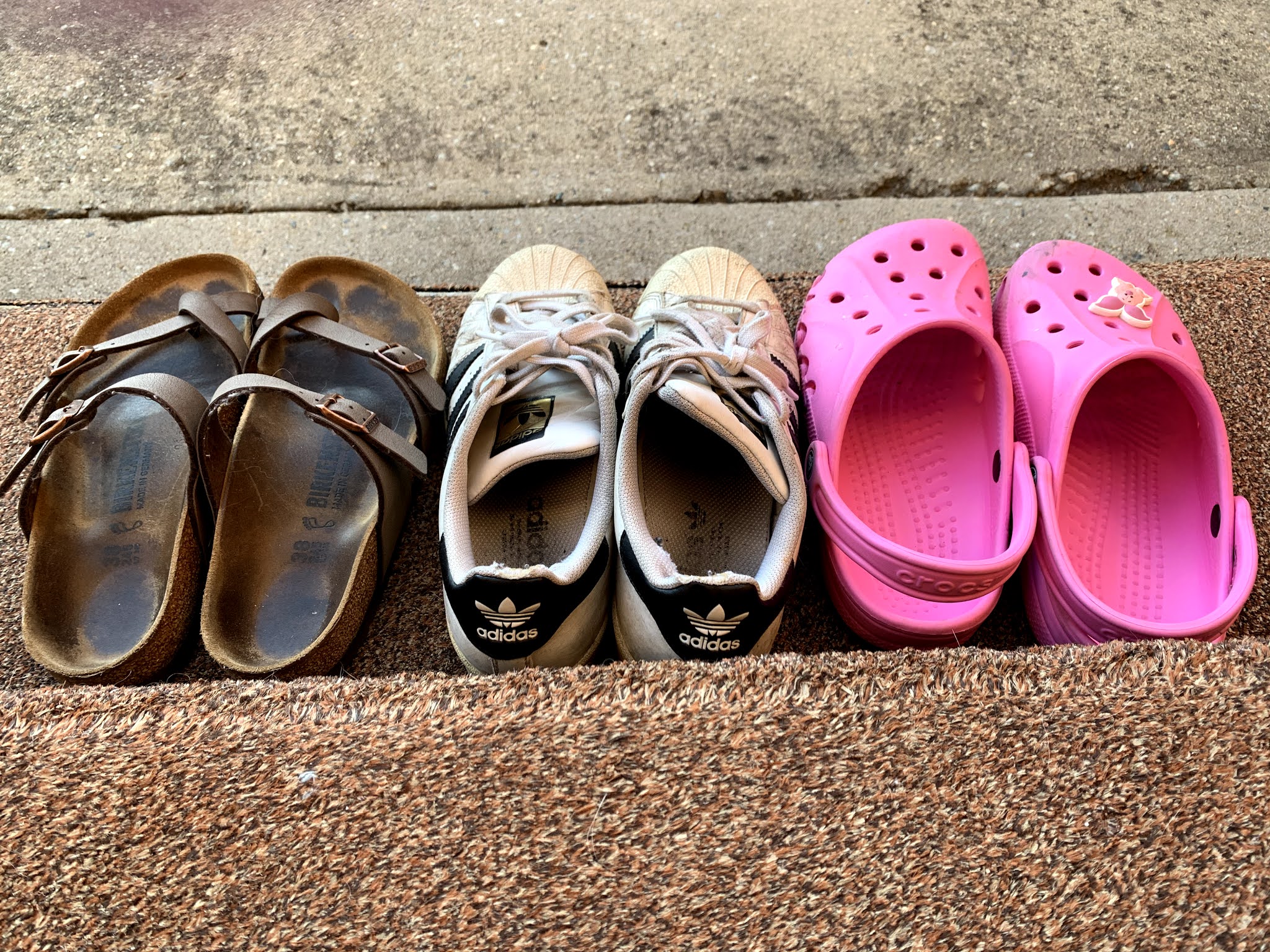
            I decided to use this picture because there are many different color options to choose from which gave me more possibilities to work with. Although there aren't really patters I still think the colors work well together even though some of them are rather vibrant. By using hues I can tone down the colors to not be so distracting to the eye.


Task 2


            To create color swatches based on this photo I used the color dropper tool to get as close to the exact colors in the picture as I could. After I got the first colors I created new tints of those colors by first changing the swatches from 100% to about 60% or 70%. Then for the lightest colors I changed the swatches to about 40% and 50% since my "dark" versions of the colors were more vibrant, making my light hues almost white if I went to 30%.


Task 3


            For the last part of this blog I used the previous color swatches to create name plates and work with contrast. When I used a dark background like the blue I made sure to use a light color for the typeface so you could read the words and not find the colors annoying. When I did the light green and the light yellow I used darker colors for the typeface so the words could be read without difficulty. Doing so makes it easier for readers to see the words and not become annoyed by any vibrant distracting colors.


https://gomedia.com/zine/tutorials/rule-three-contrast-contrast-contrast/


Wednesday, March 3, 2021

Blog 3


        To create the rough draft of my meme are started by placing the image of the teacher. I added adjustments to only this layer but clicking hue/saturation and adjusting that to what I think looks best. I then clicked layer and create clipping mask. Doing so connects only the layer below it with the adjusted hue/saturation. It was helpful to watch the adobe video when doing this to see where exactly these options are. I then added the image of the student and the text on top. To make it easier to read the text I added a glow to it as well as the stroke option so the text is outlined. Lastly I added a necklace to the teacher. To do so I created a new layer mask. This allows you to use the brush tool to remove parts of the image creating transparency. One thing I didn't realize beforehand was how tedious this process would be. Since I chose a necklace with chains there were many gaps that I had to remove with a very tiny brush. Overall it looks good but it was very time consuming.

https://helpx.adobe.com/photoshop/how-to/photoshop-layers-affected.html
https://helpx.adobe.com/photoshop/using/masking-layers.html

Thursday, February 4, 2021

Blog 2


 Write-up

    When making a business card I found it to be most important to pay attention to resizing images and text frames. In order to make the card look professional you shouldn't have the texts go past the margin lines because it will be too close to the edge of the paper when printed. You also have to know how to resize the text box by double clicking any handle to expand the frame (Noe Araujo, 9/4/19). When first creating a text box it may be too small which will still allow you to type but the words you type that go behind the text box won't be seen so you must expand the text box. It's also important to change the size of it so words don't go past the margins and get cut off the page. Overall when previewing the final product you should look to make sure anything you want to reach the end of the page goes to the bleed and your text doesn't go too far past the margins.

Thursday, January 21, 2021

Blog 1

Theme

 I have decided to use shoes as my theme because I think someone's shoes show a lot about them. It's interesting to see how worn out one pair is compared to another by the tearing or dirtiness. 


Working The Shot

Angles

This photo shows angles from a lower level which is more straight on. It focuses on one shoe more than the other showing all the dirt from the front all the way to the laces.


Lines

The lines of the steps lead you to look from the bottom of the photo to the top. The straps of the shoes and lines on the middle shoes also follow the same lines as the steps and sidewalk.


Layering

Having one pair of shoes on top of another gives a base to the photo with another layer on top. The pink crocs give the picture another object to look at on top of the Adidas.


Extra Photos